Visibility in the waiting room
Name client
Bioresonantie Volendam
Skills
Design | Project Management | Advise
About This Project
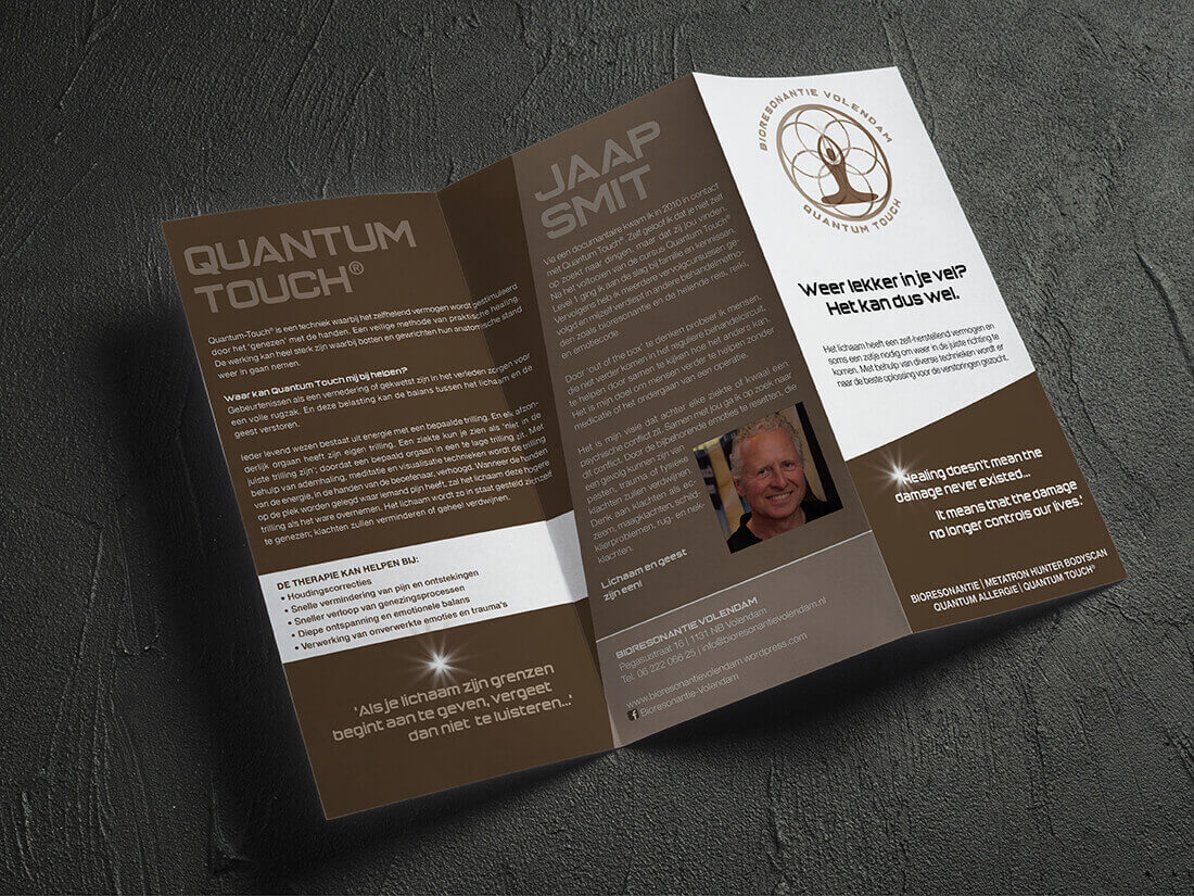
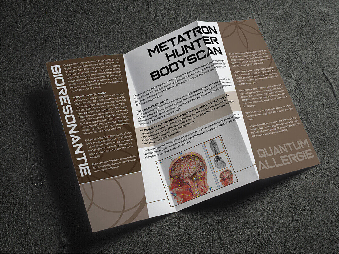
As my client rents a space in a building with other (alternative) doctors, he felt he needed to create awareness and visibility for his company in the waiting room. We ended up creating a brochure and a rollup banner. Bioresonantie Volendam focuses on healing through energy by means of Quantum-Touch, Quantum Allergy, and the Metatron Hunter Body scan.
The first step
First off, I make an inventory of the corporate identity elements that a client may have, like a logo. The client was gifted a logo design by a customer as a thank you, only to receive a file format that we couldn’t use (a jpg file which is non-adaptable, and of a low resolution. In other words, I couldn’t work with this. So, taking all the elements that were in the existing logo I reassembled them into a new vector version, built up in layers so that it can be used for different purposes.
What information shall we put in the brochure?
When creating a brochure, it’s important to think about what information you want to include, and which images illustrate what you want to say. In most cases, text and images are supplied by the client. In this case, I was asked to assist in writing the text and finding images. I trimmed the text down to a version that fits the brochure explaining the different techniques. And created a catchy title for the front page as it must trigger the reader to pick up the brochure.
Alternative to imagery
It’s not always easy finding imagery for a company or service. And especially when it’s a company that works with these specific techniques it becomes quite hard indeed. So, I used elements of the logo in a graphic way to fill up the empty spaces on the page.


