Promoting your business
Name client
Marilyn Kledingreparatie
SkillS
Design | Project Management | Advise
About This Project
How to draw attention to your company
Marilyn Kledingreparatie has been around for over 15 years. A hobby which grew into a successful business brought her to a point where she had to choose ‘grow or stop’. She opted for growth, which meant that the family moved to a new house, so she had enough space for her studio.
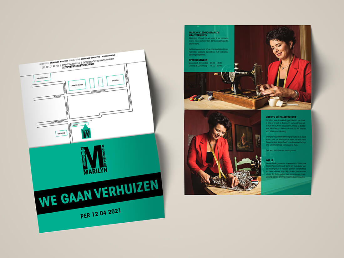
As the new house still had to be built, we had the time to sit down and come up with a plan. It also gave us enough time to get everything for the big move. Step by step we created a new corporate identity and rolled it out over all the materials we needed for the launch. Her main question was ‘How to inform existing clients about the move, and promote her company to generate new clientele at the new location’. Very simple, a flyer.
How to assemble a flyer
A flyer is a great way to promote your company. To make it personal I suggested she’d have professional photos taken. She went hunting for a photographer who matched her style and personality and found that with Rick Leeman (www.rickleemanphotography.com). These beautiful and stylish photos were used not only on the flyer but also on her website. To inform people of her new address we added a map (directions) to the new location. The feedback we received later told us people appreciated the map as they found it very helpful.
And what about the distribution of the flyers?
We printed the flyers before the move so the client could hand them out to her existing clients at her old location. Once she had moved she took to the streets and posted them herself through letterboxes. A great way of spreading your promotion without it costing a lot.
When talking about the type of flyer, the client felt she wanted one that folded upwards. So, the fold on the top. This isn’t a common way of having a flyer but it did stand out. The customer consciously chose the fold at the top whereas I would opt for a fold on the side.


