Get Ghosted!
Name client
Attitude Holland
Skills
Design | Project Management | Advise
About This Project
When, as a company, you decide to produce your own line of hair products, in addition to your web shop, you’ll soon need packaging. So, which style are you going to use? Is this in line with your current corporate identity, or will each product line get its own identity? And, what people forget, will you be expanding the range at a later stage, or is this it? Something else worth thinking about as you don’t want to run into issues at a later stage regarding issues you could’ve prevented.
Of course, we can’t all predict the future and determine whether other products will be launched in addition to this product line. But you can think about what the rollout of future products would look like.
Blonde is not always blonde
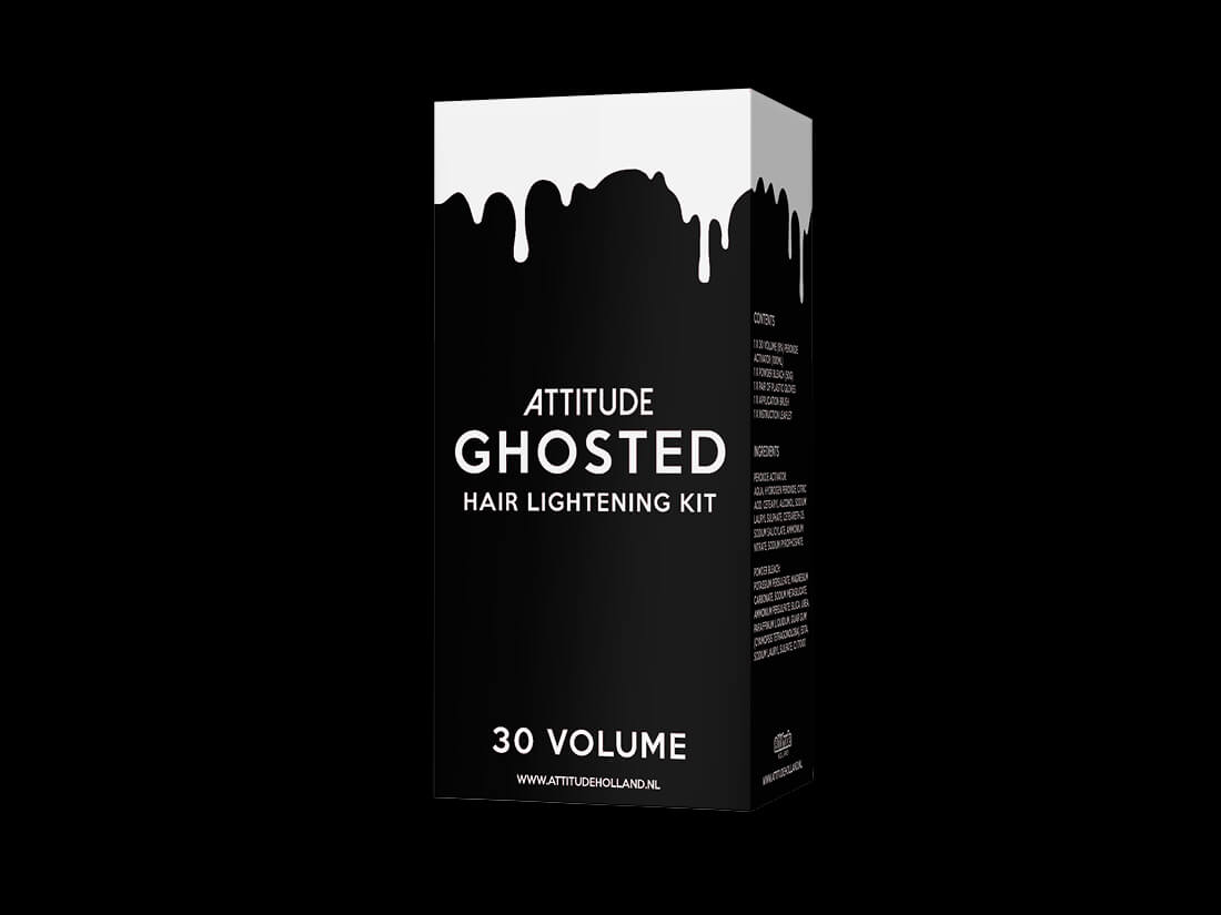
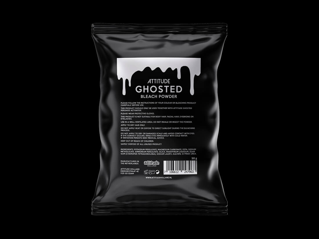
In addition to the hair dye and hair care products I designer for Attitude, I was also asked to design packaging for the bleach sets. As everyone who dyes their hair knows, to create a great colour you need to bleach it first before adding purple, pink, green or yellow. And as the bleach sets come in various strengths, we needed a separate version for each one.
Why is the packaging black and white?
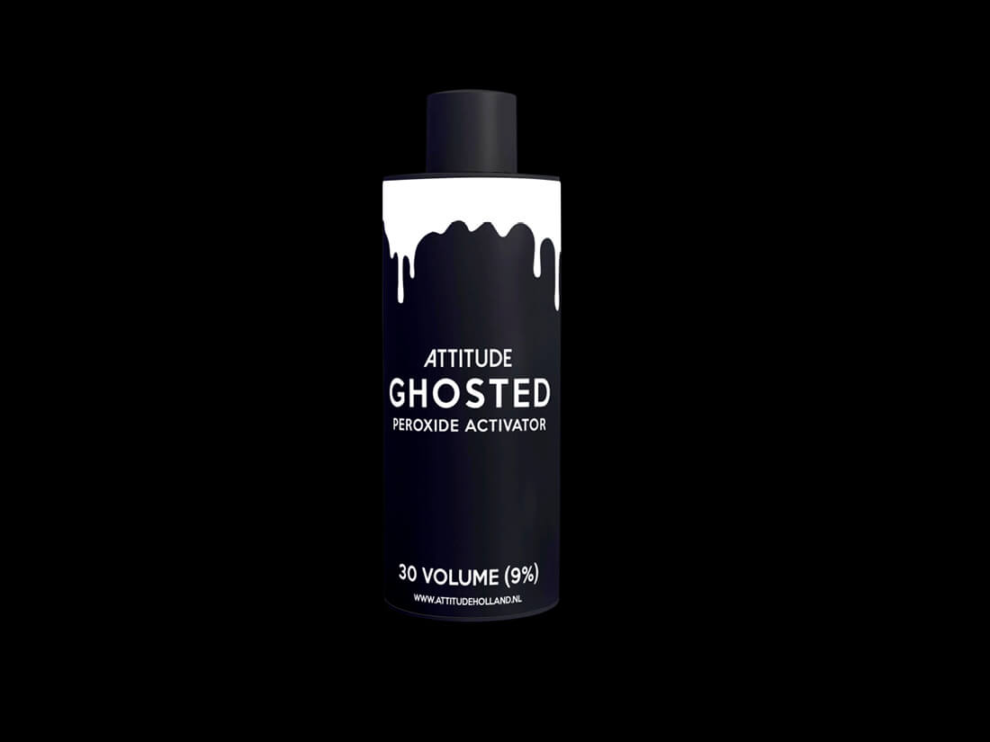
Attitude’s corporate identity is mainly black and white. Using their corporate identity and the drips from the hair dye pots I created a line that is recognised and can be translated across multiple products.
Great! Bottles…
Yes, bottles are great but cause their own little issues when it comes to design. Foremost, they’re small and require a lot of (legal) information, which brings a challenge on a technical level. Together with the manufacturer, I looked at the minimum information requirements and the font size. To avoid multiple rounds of printing, we printed the user’s guide in multiple languages on the back of the box. This saves a lot of money and makes it easier for the warehouse. They only need to pick one box instead of checking whether they have the right version in regard to language.


