From logo to visual identity
name client
Joka de Bruijn Instituut voor Huidverbetering en Wellness
Skills
Design | Project Management | Advise
About This Project
I met Joka de Bruijn when she walked into my studio in Rotterdam asking for help in attracting new clients. All she had was a logo but no visual identity. After talking to Joka it was clear she wanted her clients to have a wellness experience when visiting her salon. I went looking for images that radiated both Joka’s personality and the feeling of wellness and luxury. Leaving her logo intact and working with her existing colours and fonts, she didn’t lose brand recognition towards her existing customers.
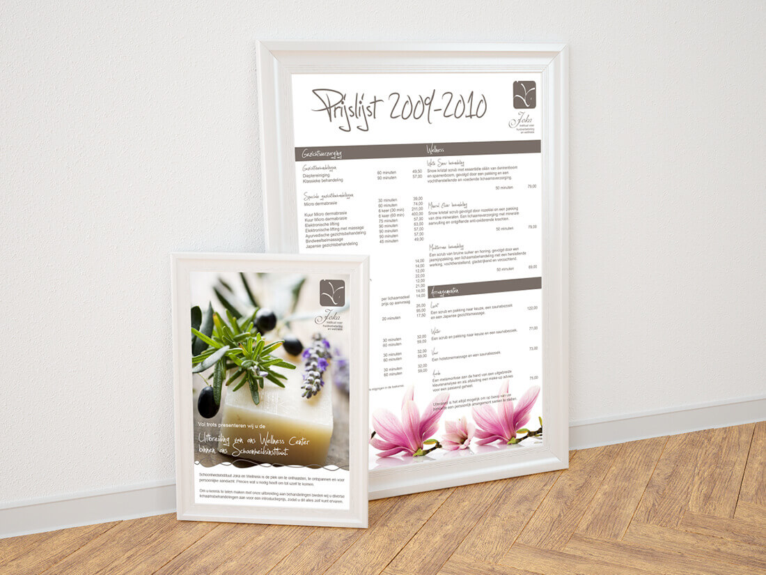
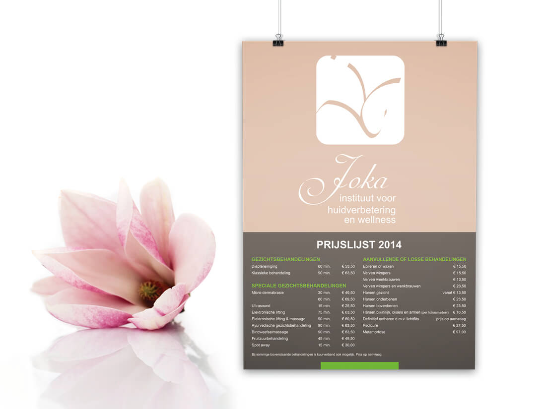
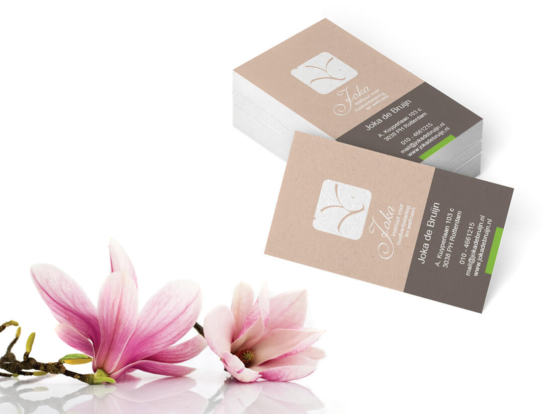
The various marketing materials created
When it came to designing the various marketing materials we opted for several items. She had a business card and an appointment card, a pricelist in the window. The window display was adapted to her new visual identity, and we produced a big batch of flyers, as the easiest way for her to acquire new clients was to distribute flyers in the neighbourhood.
This simple execution of expanding her logo into a visual identity ensured her client base grew extensively within a few weeks meaning a second flyer campaign was unnecessary.


