Corporate identity for The Sanctuary Space
Name client
The Sanctuary Space
Skills
Design | Project Management | Advise
About This Project
Every entrepreneur knows that having a corporate identity is important for their company. Whether you’re a freelancer, a small company with staff or larger. Your corporate identity is your external identity, and it must match who you are.
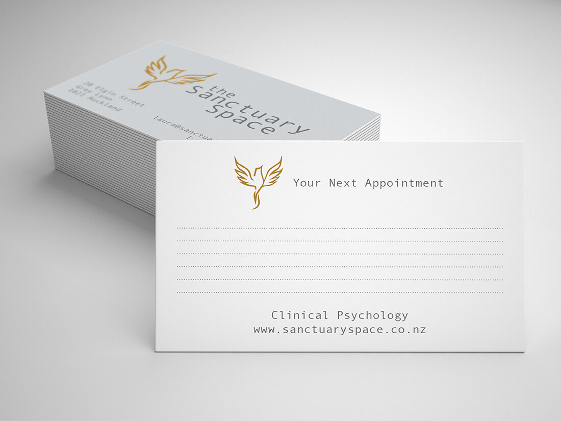
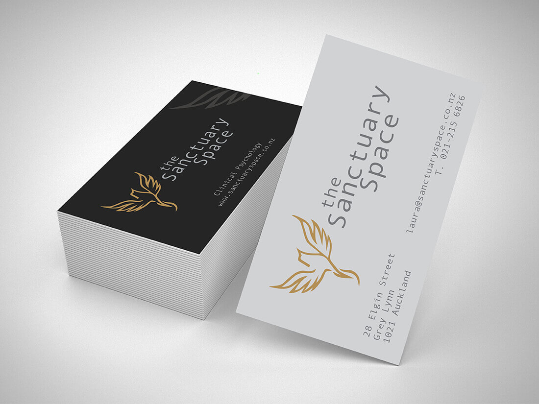
For The Sanctuary Space, based in Auckland, New Zealand, I designed a logo, business card, appointment card and website. When it comes to determining the style for the client, I sit with them to get a feeling of who they are and what they like. For me, it’s important that the style I create matches that of the person behind the company. But also, her clients need to get a sense of ‘She feels right for me’. So, the company needed to portray a place where you feel safe so that you (the client) can open up to her (the therapist).
Where did you get the idea for the logo?
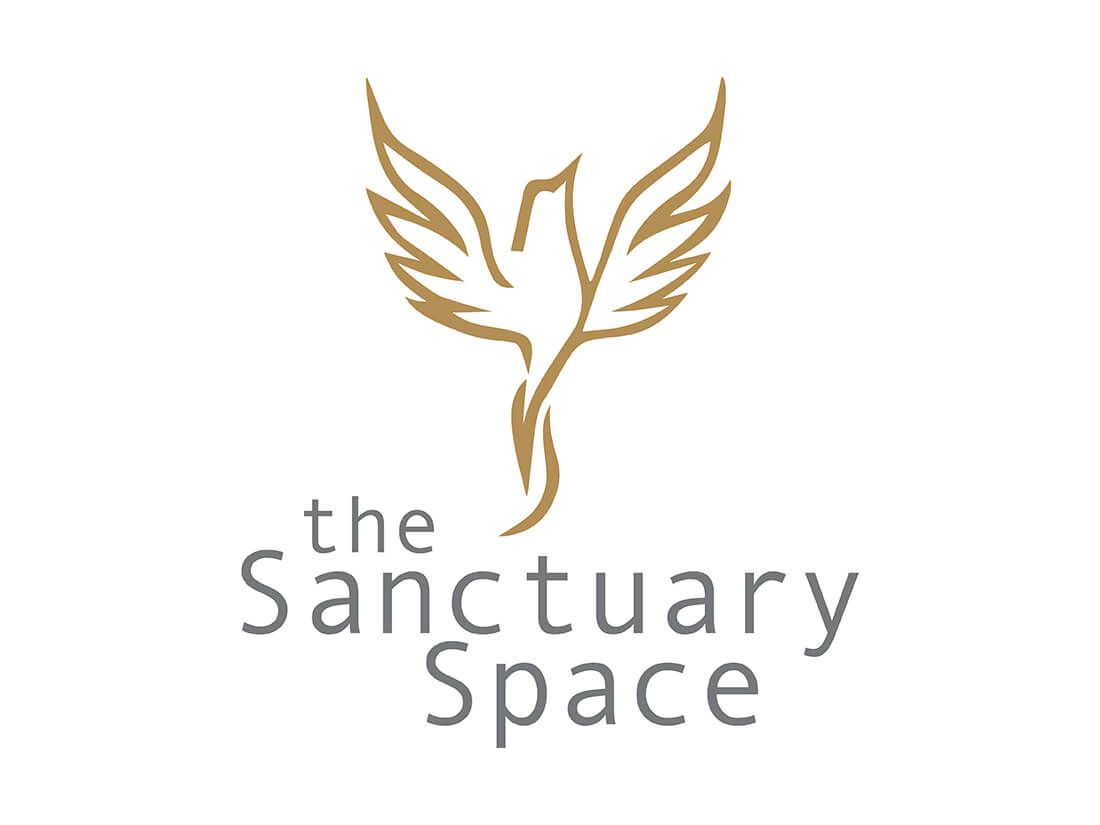
One of the most important parts of the corporate identity is the logo. The client’s initial idea was a big willow tree or flower. But both options weren’t really working for her, she was missing the feeling of ‘Freedom’. Breaking free from old patterns and learning how to deal with a situation to ultimately become ‘better’. This gave us the idea of using a Phoenix, a beautiful and powerful bird.
For the colours, the client was leaning towards vintage shades of brown, blue and green. Beautiful tints which needed to have the same colour experience both offline and online. Lots of companies don’t have their colours translated properly, so their printed work doesn’t match that of their online stuff (website and socials). But these colours weren’t easy to pick, as brown becomes ‘dirty’ so we opted for using a gold shade which looks great online as well as printed. Combining this with two shades of grey gives for the chic look and feel she was after.
You printed two types of business cards?
Yes, we did. One as a standard business card, the other for her to write the next appointment on. These days most business cards come with a glossy or matt finish but as she needed to be able to write on the appointment card, we didn’t add a finish to the card.
The website
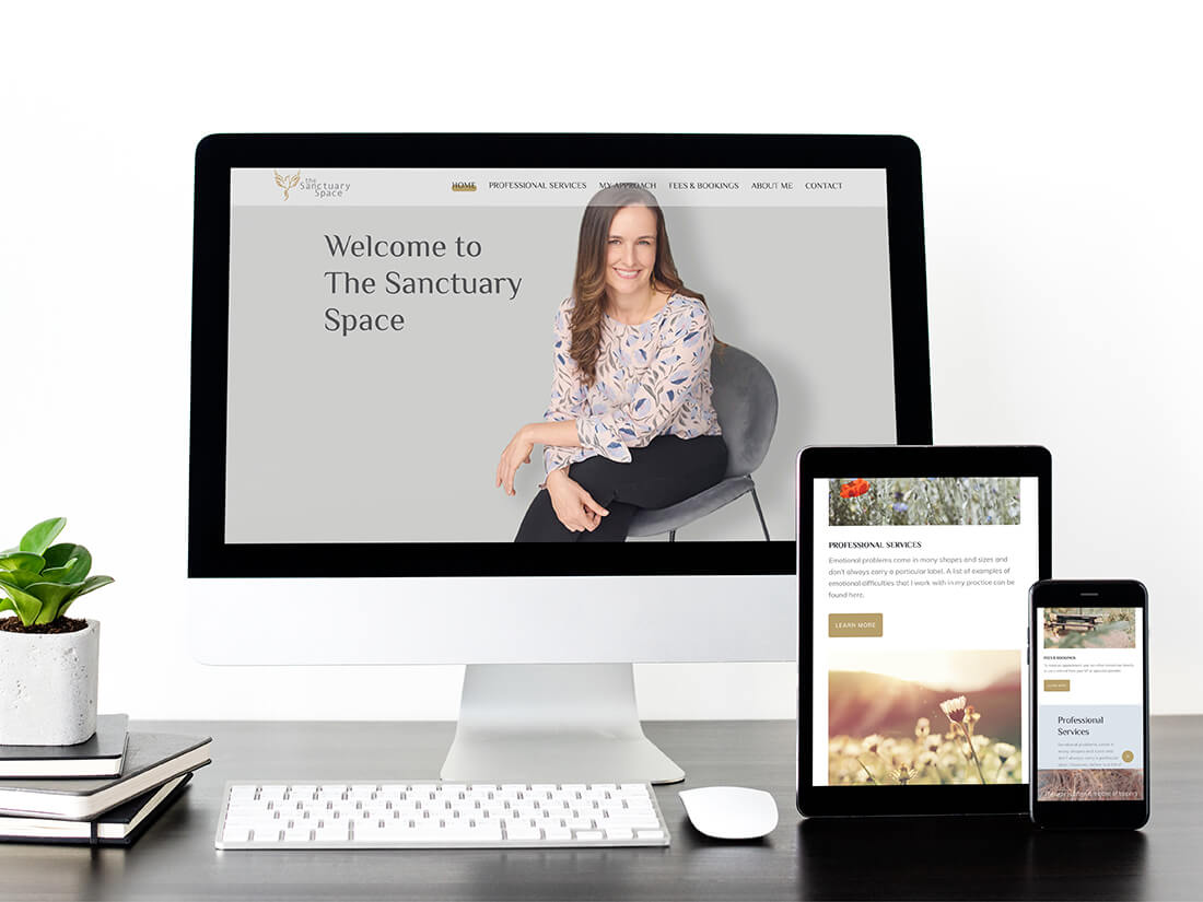
Being based in New Zealand meant that we were dealing with a huge time difference which made communication a little hard. I needed to get into contact with the hosting company but when there’s a window of a few hours in the day it becomes difficult to get the information you need. I also found that every country works a little differently when it comes to hosting packages, URLs etc. Finally, I gained access to the URL and was able to start designing. I purchased a WordPress template and converted this to match the wishes of the client. Selected images that radiate peace and familiarity and added her photo in the header, so visitors see whom they are going to be working with. We added an online appointment booking tool and styled it in her corporate colours to match the website. Now she’s set to go and bring in clients.
Check out her website at: www.sanctuaryspace.co.nz
Abroad
Whether your company is in the Netherlands or as far away as New Zealand, Emdesign can assist you in (further) developing your corporate identity. These days’ location isn’t the reason why we can’t work together.


