Baker Bridge collection catalogue
Name client
Baker Bridge (FNG Group)
Contract
Short-term contract - started off as Freelancer
Skills
Design | Project Management | Advise
About This Project
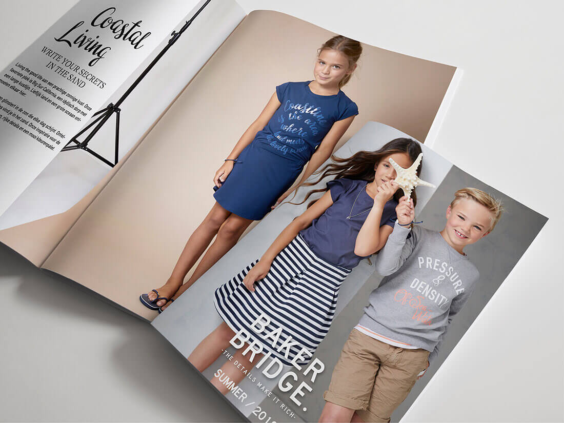
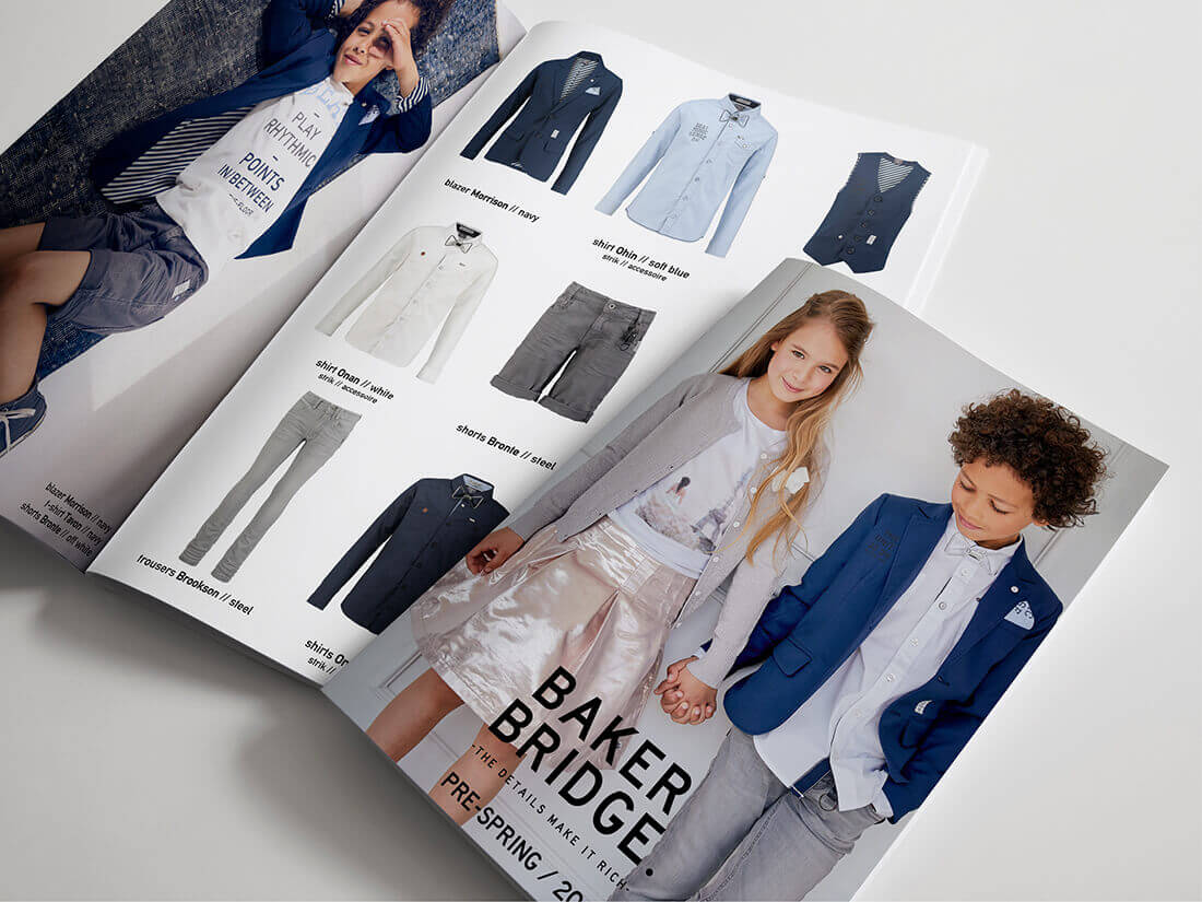
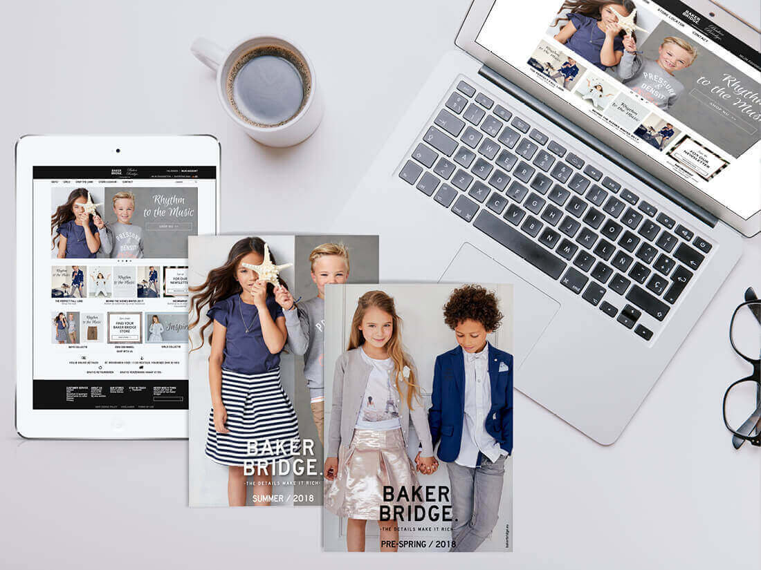
Twice a year Baker Bridge releases a new children’s clothing collection for boys and girls. To draw attention to these beautiful collections, we decided to create one brochure (or catalogue) rather than the annual fold-out card. The catalogue is aimed primarily at wholesalers, but since consumers order through the website, I suggested including a copy with each order that got shipped out. Ultimately, it’s the consumer who buys the clothing and with online shopping, people don’t visit shops as often as they used to.
Who decides on the style of the brochure?
The marketing department at Baker Bridge consists of two ladies who design the entire collection. Therefore, they are the go-to people when it comes to determining the style of the brochure. They decide on the theme of the collection and the style of the photography and together we created an overview of the page layouts before I got to work.
How do you show two collections in a booklet?
The challenge this year was to combine two collections (summer and pre-spring) in one brochure. So, what better way to flip it over halfway? This way each collection has its own front page and content. A great way to save money on printing, and the stores can just flip over the book at the next season making it seem like there’s a new brochure on display, when in fact, it’s still the same edition.


