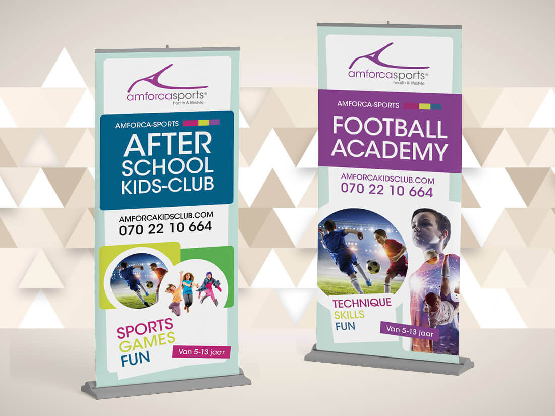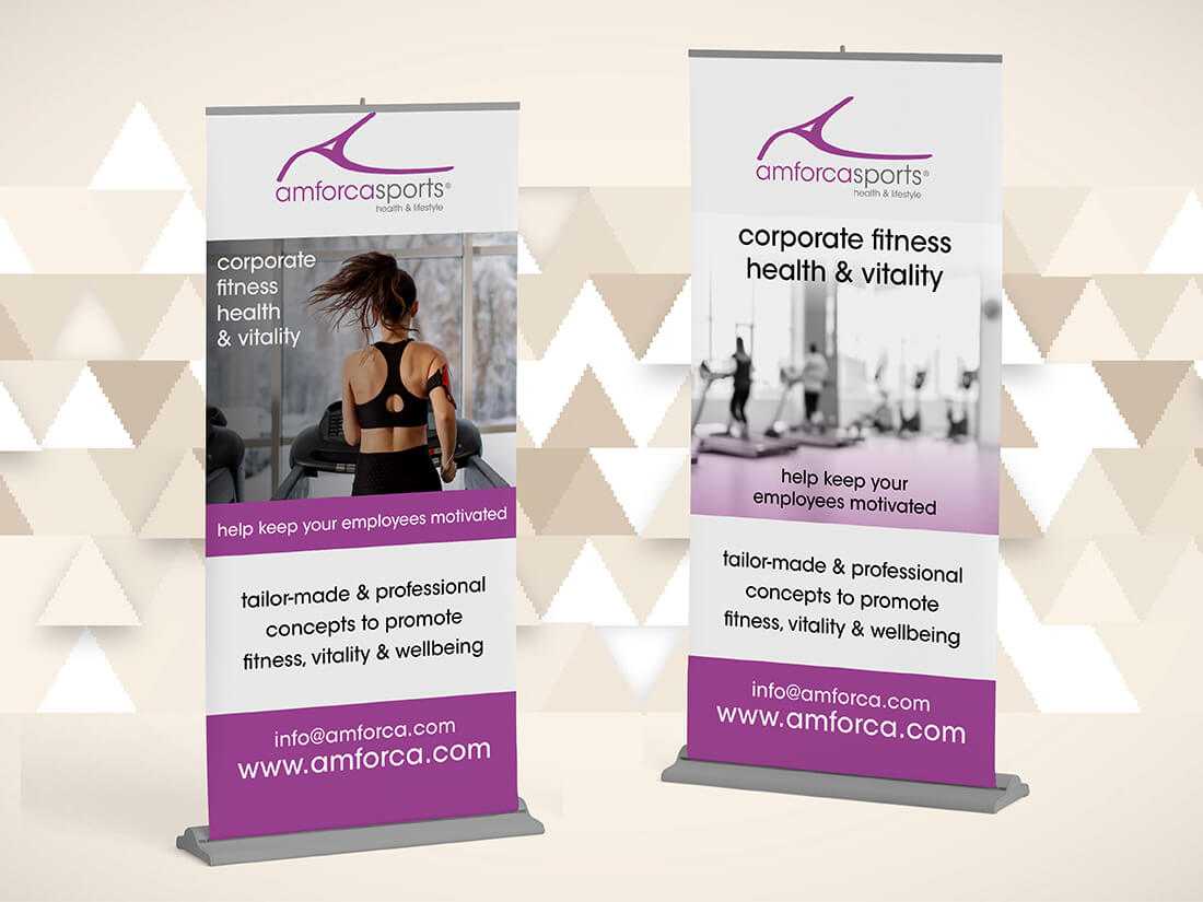
Roll out the roll-up banners
Name client
Amforça
Skills
Design | Project Management | Advise
About This Project
One of the easiest marketing tools for your business are roll-up banners. They’re versatile, easy to set up and take down, and therefore suitable to take anywhere. Whether you choose a wide or narrow one. They come in a carrying case that can easily be carried over your shoulder.
What should you pay attention to when designing a roll-up banner?
Most roll-up banner are around 2 meters in height thus the client feels they need to utilise the entire allocated space. After all, you have 2 meters of space for information, so why not? But what most people forget, people don’t read below the meter line, let’s say from the hip down. Just think, do you look down when you walk through a trade fair? That’s why I recommend your message to be at eye level and to then place your contact details around the 1,20 meter line, leaving the remainder for an image or illustration.
People also forget where they are going to place the banner. Is it located at the back of the stand, behind a table or cupboard? Or at the front in the walkway with people standing in front of it? Which also means the information is concealed. All things to think about, and that’s why you hire me, so I can pay attention to these details.
So, when I design roll-up banners, I tend to ask questions like: where will it be placed, what’s it intended for, what do you want to convey to your target group? And take this information to decide what goes where.
Corporate and kids
For this client I designed a range of roll-up banners. A corporate version to be placed in the gym during training sessions. And a kids sports version to be placed at the BSO to create a barrier between the different spaces. Then we placed a few of the behind the bar to shield off the drinks section, causing a large part of the print to be lost. All things to consider during the design process.
What should you think about when wanting your own banners?
If you’re planning on having roll-up banners made for your company, then it’s good to think carefully about where it will be placed, what you want to communicate, and to realise that most of it won’t be seen or read, so keep your information concise. And leave it to the designer to create the perfect result.
Want to know whether a roll-up banner is a suitable marketing tool for your company?
Feel free to ask for examples and advice.


