Reading into numbers
name client
Numerologie Reading
Skills
Design | Advise
About This Project
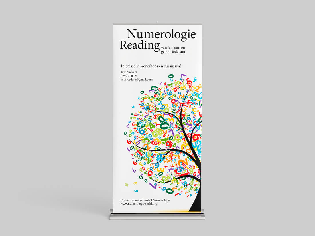
Whenever you attend an exhibition or event, it’s always good to have a sign saying what you do. For smaller events, a rollup banner can suffice. Anything bigger and you often get into a problem of there not being enough space.
When the client approached me needing advice on how to portray herself at an upcoming event, I suggested a rollup banner she could place behind her. At the previous event, she only had a small sign on the table and a lot of people walked right by her. With a banner behind her people would see straight away what she does and could then sit down for a reading.
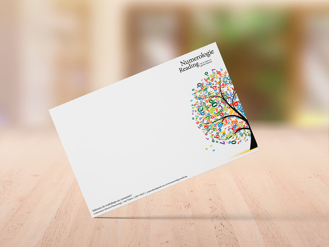
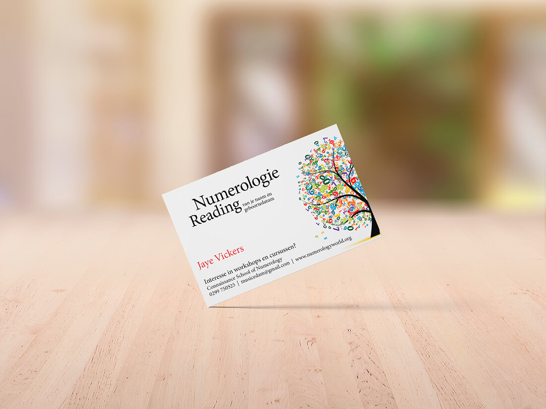
While we were developing the banner, she mentioned that she wrote her readings on a simple A4 piece of paper. No branding, nothing. So, people took away her notes but didn’t have any information regarding who she was etc. So, we designed an A4 sheet which she could use for notes during her reading and accompanied that with a business card in the same style.
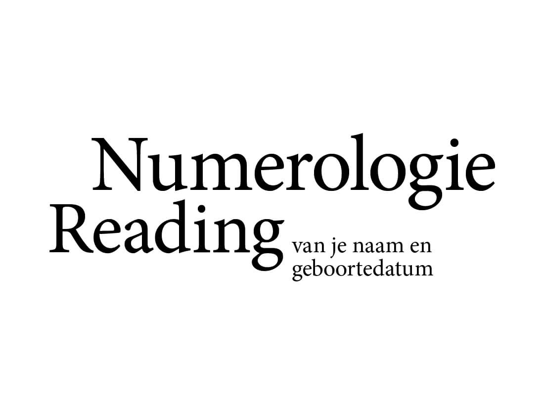
That’s an unusual logo you designed
Yes, it is, instead of using an icon or symbol, I just used text. This happens quite often but as it’s a lot of words it’s quite unusual to do it this way. As the client didn’t have a logo and we needed the text on the banner to say exactly what she does, this option as a logo works well. Using it with the tree of numbers makes it a nice playful whole. And even if you’d use the logo as a stand-alone, it will work perfectly.


